Logo for Pope Francis’ penitential pilgrimage to Canada
By Francesca Merlo
July 22 2022
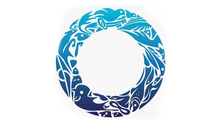
The logo for Pope Francis’ “Penitential Pilgrimage” to Canada, from 24 to 30 July, was designed by Indigenous graphic artist Shaun Vincent.
Pope Francis will travel to Canada from July 24-30, stopping off in Edmonton, Maskwacis, Quebec and Iqaluit as has already been announced in his itinerary. At the Angelus on Sunday, 17, the Pope stressed that this will be an eminently “penitential” pilgrimage , which “may contribute to the journey of healing and reconciliation already undertaken,” in reference to the “policies of cultural assimilation that in the past have gravely harmed, in various ways, the native communities” in North America.
The creation process
The team for this papal visit has explained the official logo for the trip to Canada.
“My creative process is inspired by nature, particularly in my family’s land in St. Laurent, Manitoba, a Métis community where I ground myself and am reminded where and who I come from – often with a dose of humility and always good humour.” -Shaun Vicent
Owner of Winnipeg-based company Vincent Design, Shaun was hired by the visiting team in early 2022. After a long discernment, talking with elders and family members, he made the decision to participate in creating the visuals for Pope Francis’ historic visit to Canada.
“For this logo, community is at the centre of what I wanted to portray, with the reindeer and herds of bison, the fish and eagles, with a dove of peace and the keys of St Peter representing the Holy Spirit and the Pope – placed amongst the animals and elements of earth, sky and water. Wherever we go on this journey of healing and reconciliation, we go together,” explained Shaun Vincent.
Shaun Vincent’s design
About the circle
In explaining why the logo is circular, Shaun Vincent emphasises that “to really walk together for purpose requires direction and focus. A circle-shaped grandfather drum gives rhythm to the dance circles. Circles of flowered beads sparkle during the violinist’s melody. A circle of arms outstretched while throat singing under the circle of the sun. The circle can be found everywhere in Indigenous life. In a circle, all are equal, all are visible. The ceremony needs this symbol. It is history, it holds our stories. It is who we are. A symbol to represent this event must have trust and calm at its centre. That’s why I chose this symbol as its core, with the teachings existing within its shape.”
The impressions
Since it was presented, the design has elicited glowing reviews. “We are very pleased with the work of Shaun Vincent and his team,” said Jasmin Lemieux Lefebvre, digital communications lead for the papal visit team.
Jasmin Lemieux Lefebvre further stated, “We are grateful that Shaun who was able to bring his creative vision to life and incorporate so many important elements into the logo. This important visual is a powerful symbol of our ongoing healing and reconciliation journey.”
The cities
Given Canada’s vast landscape, Pope Francis will use only three communities as a base for his visit to Canada. The cities chosen are: Edmonton, Quebec City and Iqaluit.
Edmonton: is home to the second largest number of Indigenous people living in Canadian urban centres. In addition, 25 residential schools were located in the province of Alberta.
Iqaluit: with a population of 8,000 people, is home to the largest number of Inuit, who are members of the indigenous Eskimo nation inhabiting Canada’s Arctic regions (approximately 3,900). Pope Francis was personally invited by Inuit delegates to visit the North during their meetings in March.
Quebec City offers an eastern hub for those who wish to travel to be with Pope Francis, especially the indigenous peoples of the east. The region is also home to Ste. Anne-de-Beaupré, is one of the oldest and most popular pilgrimage sites in north america, attracting indigenous peoples and others from across Canada and around the world each year. – Vatican News


